In the previous post, I explained why Power BI is not the full data architecture. The dashboard is only the final layer. This post goes one level deeper into the layer that usually decides whether reporting succeeds or fails: the semantic model.
Microsoft describes Power BI semantic models as data that is ready for reporting and visualization. That sounds simple, but the word ready is doing a lot of work. Ready means the tables are shaped properly. Ready means relationships are predictable. Ready means the same KPI returns the same number every time. Ready means a finance manager, operations manager, and executive can use different reports without arguing about the definition of revenue.
A semantic model is not just a technical layer. It is the contract between raw data and business decisions.
Why dashboards lose trust
Most dashboard trust problems are model problems. The visual may be clean, the colors may be polished, and the filters may work, but the report will still fail if the model gives users inconsistent numbers.
The common pattern is a single flat export from Excel, SQL, or a business system. Someone loads it into Power BI, creates a few visuals, writes a quick measure, and ships the dashboard. It works for the first report. Then the second report needs slightly different filters. The third report needs year-to-date. The fourth report needs row-level security. Soon, every page has its own workaround.
That is how trust breaks. People stop asking what the dashboard says and start asking which dashboard everyone else is looking at.
Clear grain
Every fact table needs a clear level of detail: one row per sale, order line, transaction, ticket, stock movement, or monthly snapshot.
Star schema
Keep facts for numbers and dimensions for filtering. This makes reports easier to use, faster to query, and simpler to explain.
Reusable measures
Define revenue, cost, margin, active customers, transactions, and growth once. Every report should reuse those definitions.
Shared calendar
Use a proper date table so year, quarter, month, week, fiscal period, and time intelligence behave consistently.
Security rules
Design row-level security around real business access: region, department, branch, portfolio, customer group, or manager.
KPI dictionary
Document each important metric in business language so the model can survive handover, audits, and new report requests.
Start with the grain
Before relationships, measures, or visuals, define the grain of each fact table. Grain means what one row represents.
In a sales model, one row might be one order line. In a transaction model, one row might be one payment. In an operations model, one row might be one service ticket, one branch-day, or one monthly target. If the grain is unclear, totals become risky because the model may double-count, undercount, or mix levels of detail.
A simple test: if someone points at one row in the fact table, the team should be able to explain exactly what that row means.
Use a star schema, not a report-shaped table
Microsoft recommends star schema principles for Power BI models because they make models easier to query, filter, group, summarize, and understand. In a star schema, fact tables store measurable events and dimension tables describe those events.
A fact table answers quantity, value, and event timing questions. A dimension table answers customer, product, branch, salesperson, region, and period questions.
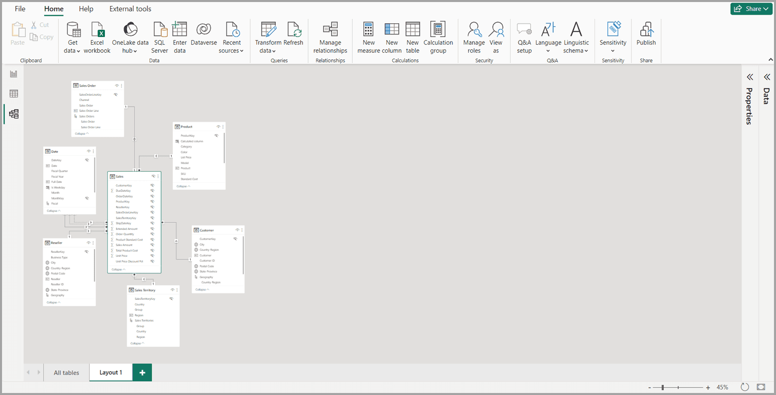
Microsoft Power BI model view example. A trustworthy model should make table roles and relationships clear before reports are built.
What belongs in facts
Fact tables should hold measurable business activity: sales amount, quantity, cost, transaction count, budget amount, service duration, uptime minutes, or balance snapshots. They usually contain keys that relate to dimensions, plus numeric columns that measures can aggregate.
What belongs in dimensions
Dimension tables should hold descriptive attributes: customer name, product category, branch, city, country, channel, salesperson, department, calendar month, or fiscal year. These are the fields people use to filter, group, slice, and explain the numbers.
Build relationships deliberately
Relationships are how filters move through the model. A category filter should reach the sales table through a clean path. A date filter should affect the correct date column. A branch filter should not accidentally filter unrelated data.
Power BI can autodetect relationships, but a production model should not depend blindly on autodetect. Check cardinality, direction, active relationships, inactive relationships, and ambiguous paths. Be careful with bidirectional filtering. It can be useful in specific scenarios, but using it everywhere usually hides design problems and can hurt performance.
Write explicit DAX measures
Business teams trust measures when they are reusable and named clearly. Avoid building important KPIs as quick visual-level calculations. Put them in the semantic model and reuse them everywhere.
For a business model, I would expect measures like:
- Total Revenue
- Total Cost
- Gross Profit
- Gross Margin %
- Transaction Count
- Average Monthly Revenue
- Year-to-Date Sales
- Budget Variance
The exact measures depend on the organization. The important principle is that the semantic model owns the definition. If revenue excludes tax, refunds, or internal transfers, document it. If active customer means a customer with at least one transaction in the last 90 days, put that logic in the model and the KPI dictionary.
Create a real date table
A date table is one of the most important tables in a Power BI model. Microsoft guidance describes it as a consistent feature you add to data models because teams need to filter and group by periods such as years, quarters, months, and weeks.
Do not rely on random date columns inside fact tables for serious reporting. Create a date table with one row per date, mark it as the date table, and include the calendar fields the business actually uses: year, quarter, month, month number, week, fiscal period, and any local reporting periods.
This is what makes time intelligence reliable. It also prevents every report author from building their own calendar logic.
Add row-level security early
Row-level security should be part of the model design, not a final patch. Microsoft guidance is clear that RLS filters table rows; it does not hide model objects like tables, columns, or measures. That means the model structure still matters.
In practical terms, decide who is allowed to see what before publishing the report. Regional managers might only see their region. Branch managers might only see their branch. Client-facing users might only see their portfolio. Finance might see all regions, but operations may only see operational fields.
A clean model makes RLS easier. A messy model turns security into trial and error.
Build a KPI dictionary
The KPI dictionary is where trust becomes visible. It does not need to be complicated. It should answer these questions for every important metric:
- What is the metric called?
- What business question does it answer?
- Which source system owns it?
- What is included and excluded?
- How often does it refresh?
- Who owns the definition?
Without this, the report may look professional but still be impossible to audit. With it, the model becomes easier to maintain, hand over, and extend.
Mistakes to avoid
A practical build checklist
When I build a Power BI model for a client, I want the model to be usable by the next report as well as the first one. This checklist keeps the work grounded:
Define the business questions and the KPIs before opening Power BI Desktop.
Identify the authoritative source for each metric and owner.
Separate facts from dimensions and confirm the grain of each fact table.
Create one shared date table and mark it as the model date table.
Create explicit DAX measures for all reusable business metrics.
Hide technical columns that report users should not drag into visuals.
Use display folders, names, descriptions, and formatting to make the model understandable.
Test filters, totals, drill-through pages, and row-level security with real user scenarios.
How this connects to the full Microsoft data stack
The semantic model sits between the data platform and the reports. Source systems, pipelines, storage, and governance feed it. Power BI reports, dashboards, alerts, and mobile layouts consume it.
That is why a semantic model is not just a Power BI detail. It is a central part of the Microsoft data architecture. If the model is strong, teams can build multiple dashboards from the same definitions. If it is weak, every new dashboard creates more confusion.
For most organizations, the goal is not more visuals. The goal is one trusted model that can answer more business questions over time.
Useful Microsoft references
These official Microsoft Learn pages are the references I used for the modeling guidance in this article: