Most teams ask for a Power BI dashboard when what they actually need is a reporting system. The dashboard is important, but it is only the last mile. If the source data is messy, if KPIs are defined differently by every department, or if refresh depends on someone exporting Excel files every Friday, the dashboard will eventually lose trust.
That is why I describe this service as Power BI and Microsoft data architecture, not just dashboard design. The goal is to build the platform behind the dashboard so the numbers are repeatable, secure, and useful after launch.
Microsoft Fabric supports end-to-end data workflows such as ingestion, transformation, analytics, and reporting, with workloads like Data Factory, Data Engineering, Data Warehouse, Real-Time Intelligence, and Power BI operating over a shared platform. That is the architecture conversation behind a serious Power BI project.
The dashboard is the presentation layer
A Power BI report is where users see KPIs, charts, filters, drill-through pages, and alerts. It is where an executive sees revenue, an operations manager sees exceptions, and an analyst investigates what changed.
But a report cannot repair weak architecture by itself. If two reports calculate gross profit differently, if customer names are typed differently across files, or if the warehouse has no refresh plan, Power BI will only make the inconsistency more visible.
These are the symptoms I look for before starting a build:
- Every department has its own spreadsheet and its own version of the truth.
- The same KPI has different formulas in finance, operations, and management reports.
- Refresh breaks because the data depends on manual exports or a laptop gateway.
- Users can see data they should not see because row-level security was never designed.
- The report looks polished, but nobody can explain the source, transformation logic, or owner.
What a complete Microsoft data stack includes
The right stack depends on the business, licensing, data volume, security needs, and team maturity. A small company might need a clean SQL database, Power Query transformations, and a governed Power BI model. A larger organization might need Microsoft Fabric, OneLake, Data Factory pipelines, Purview governance, deployment pipelines, and multiple workspaces.
The pattern is the same either way: define the data journey from source to decision.
Source systems
Start by documenting where the data lives today: Excel workbooks, SQL Server, Azure SQL, APIs, SharePoint lists, CSV exports, SaaS systems, and legacy databases.
Ingestion and pipelines
Move data on a schedule, with clear transformation logic and failure visibility. The tool could be Fabric Data Factory, Power Query, Dataflows Gen2, notebooks, or Azure Data Factory.
Storage layer
Create the durable analytics layer before the report. This might be OneLake, a Fabric Lakehouse, a Warehouse, SQL Server, Azure SQL, or a hybrid pattern.
Semantic model
Define trusted business logic once: star schemas, relationships, measures, calendars, hierarchies, reusable DAX, and names the business can understand.
Reports and dashboards
Build the visible layer: executive dashboards, operational pages, drill-through views, trend analysis, maps, Top-N tables, bookmarks, alerts, and mobile layouts.
Governance and delivery
Production reporting needs ownership, row-level security, refresh strategy, sensitivity labels, deployment pipelines, workspace structure, training, and handover documentation.
Where Microsoft Fabric fits
Fabric is useful when the project needs more than a single report file. It brings data integration, engineering, warehousing, real-time analytics, data science, Power BI, and governance closer together. OneLake gives the tenant a unified analytics data lake, while Data Factory handles movement, transformation, and orchestration.
That does not mean every client needs every Fabric feature. A good architecture chooses the smallest reliable stack. Sometimes that is Power BI plus a well-designed SQL layer. Sometimes it is a Fabric Lakehouse with Data Factory, notebooks, a Warehouse, semantic models, and Power BI reports. The point is to make the choice deliberately.
Power BI semantic models matter
Microsoft describes semantic models as data that is ready for reporting and visualization. In practice, this is where a Power BI project either becomes maintainable or becomes fragile. The model should hold reusable business definitions: revenue, cost, margin, active customer, retention, service level, transaction count, and whatever else the organization depends on.
Once the model is clean, reports become faster to build and easier to govern. Teams can create multiple dashboards from the same trusted definitions instead of rebuilding formulas on every page.
Governance is part of delivery
Reporting becomes production-ready when security, ownership, and lifecycle are clear. That includes workspace design, row-level security, sensitivity labels, refresh schedules, deployment process, usage monitoring, and documentation. Microsoft Purview becomes important when the organization needs broader visibility, governance, compliance, and protection across its data estate.
What the service includes
A complete engagement should leave the client with more than a beautiful report. It should leave them with a system they can understand, operate, and extend.
Data source audit with ownership, refresh frequency, and quality risks
KPI definition workshop so revenue, cost, margin, active customers, and operational metrics mean the same thing everywhere
Microsoft architecture recommendation for Fabric, Power BI, SQL Server, Azure SQL, or a hybrid setup
Data transformation design using Power Query, Dataflows Gen2, Data Factory, notebooks, SQL, or the simplest reliable option
Semantic model design with relationships, reusable DAX, calendars, measures, and a clear KPI dictionary
Power BI report design for executives, operations teams, analysts, and mobile users
Row-level security, workspace structure, access control, refresh setup, and delivery documentation
This is why the service page is built around the message Build the data platform behind the dashboard. The dashboard gets attention, but the platform is what keeps the report useful six months later.
The report types this service covers
Different teams need different reporting experiences. An executive dashboard is not the same thing as an operations report, a finance variance view, or a research dashboard. The architecture should support all of them without rebuilding the data model from scratch every time.
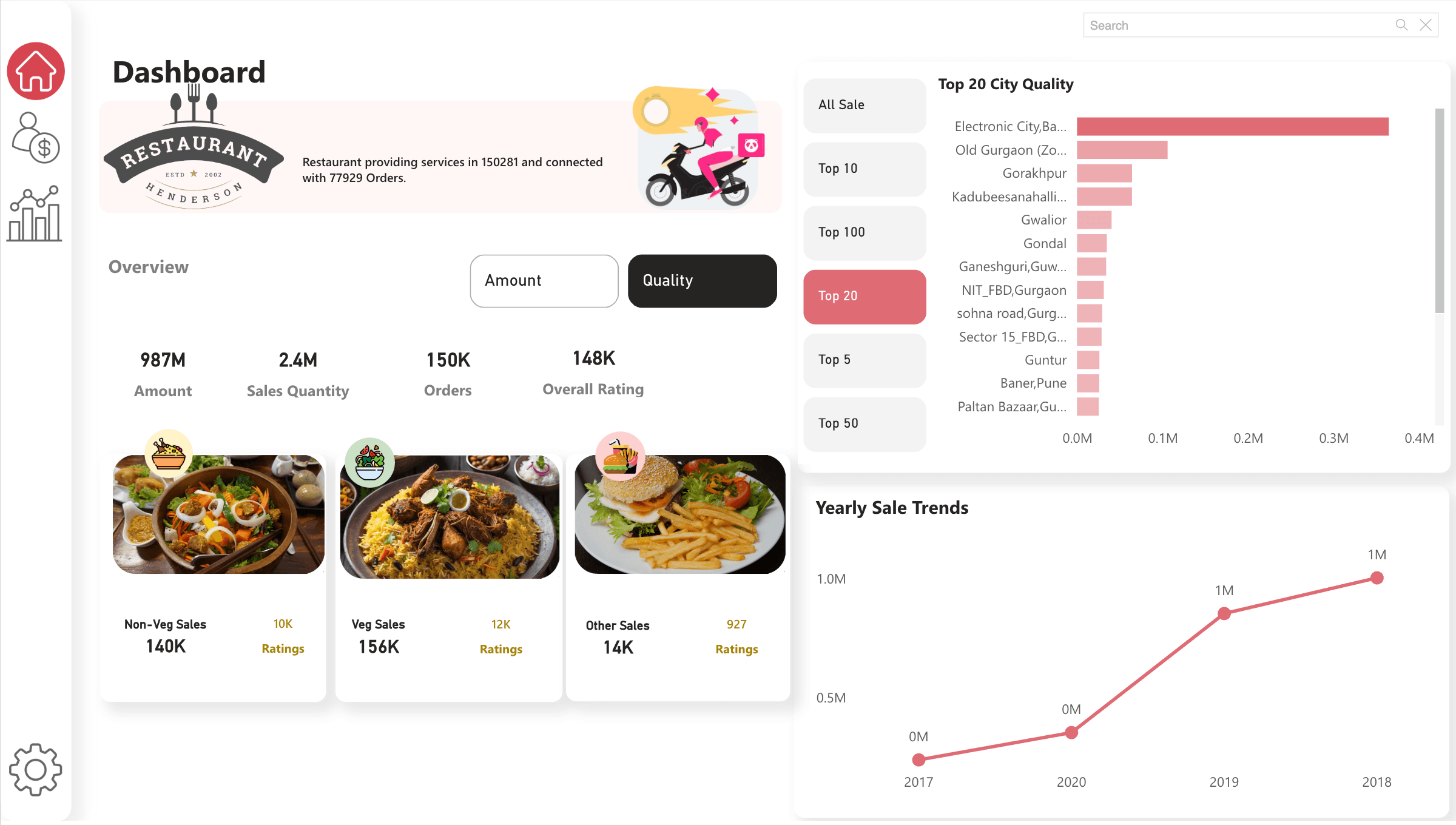
Restaurant operations
Sales, ratings, food categories, top city analysis, orders, and yearly trends.
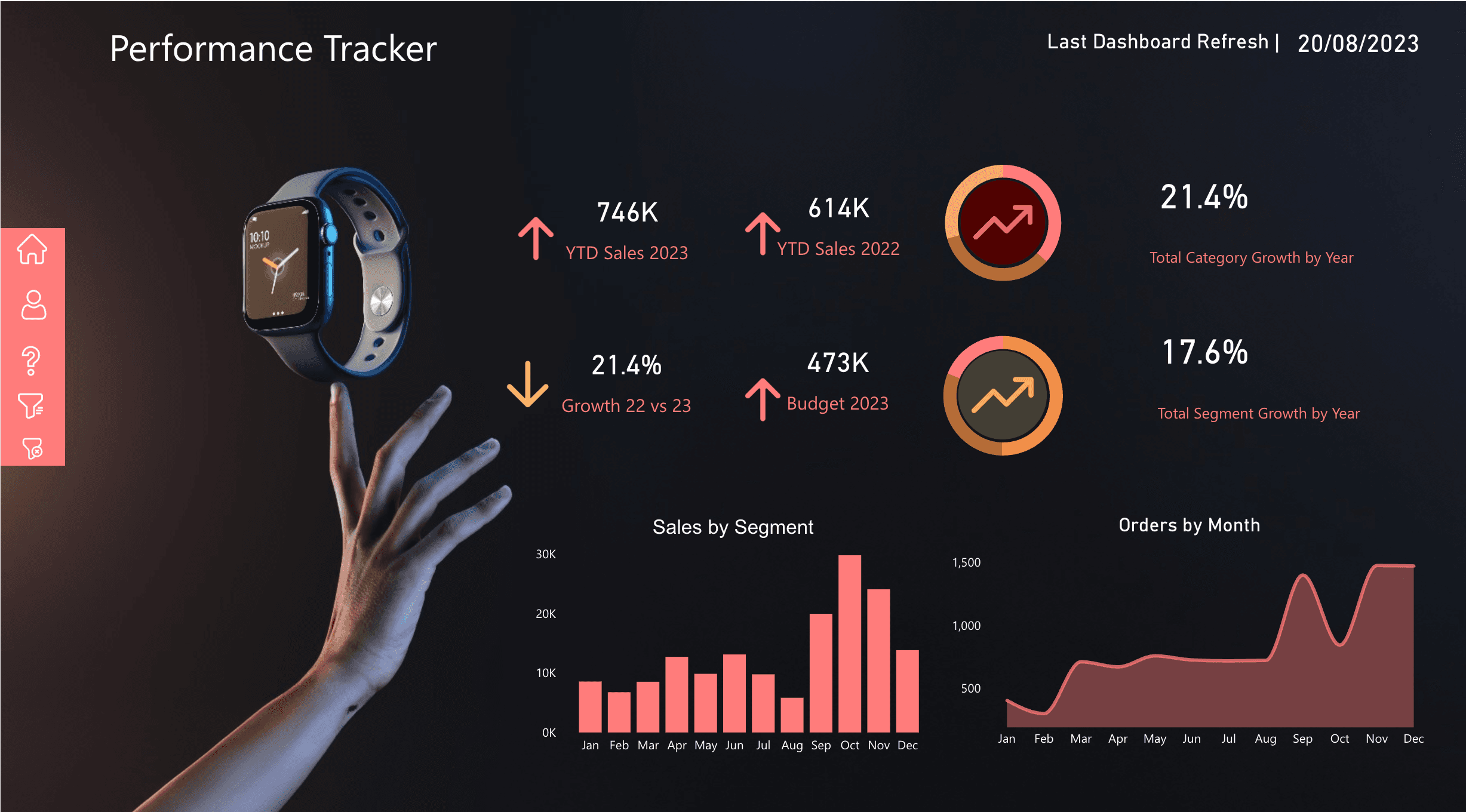
Performance tracker
Budget vs actuals, YTD sales, growth, segments, order volume, and refresh health.
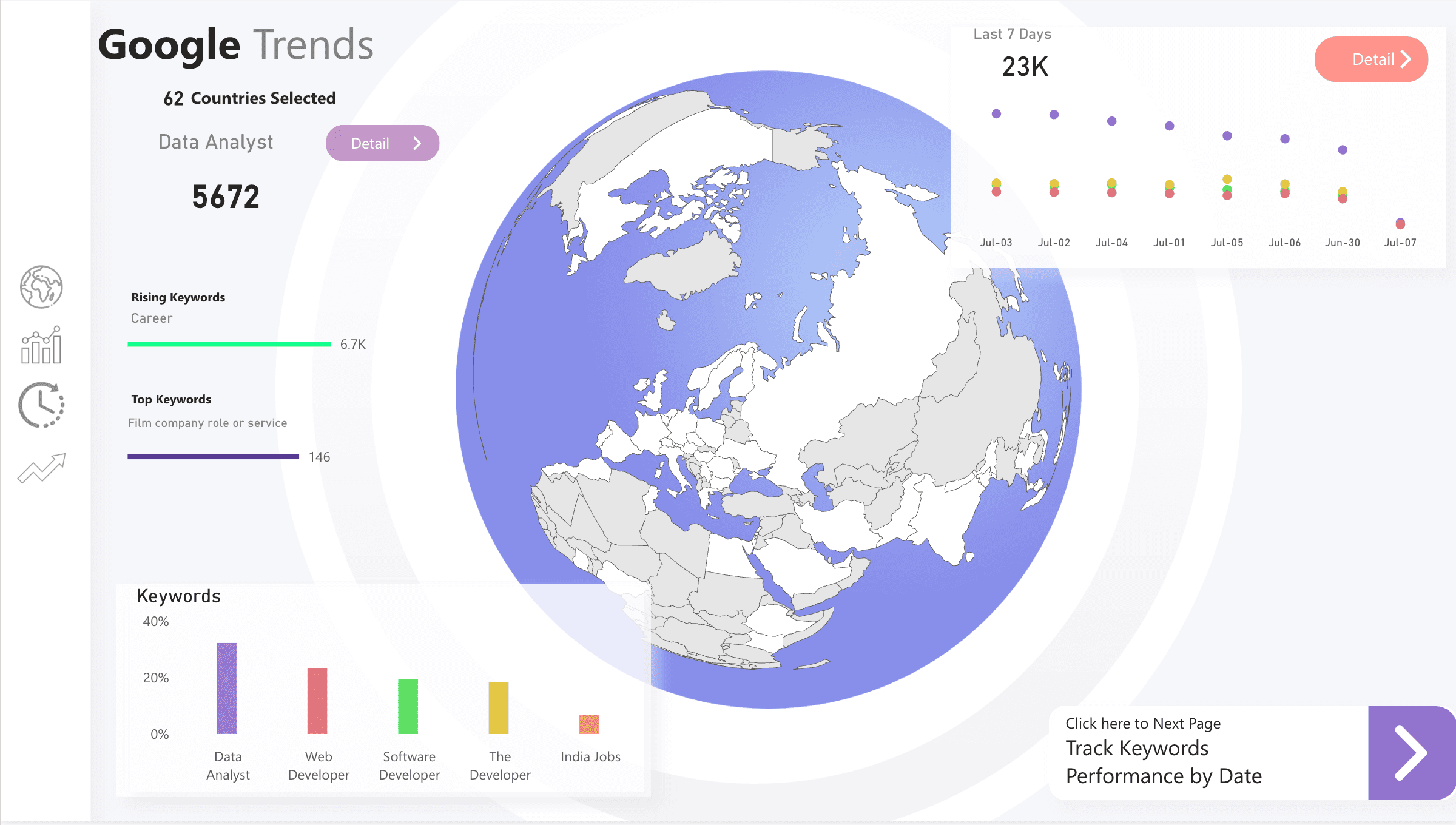
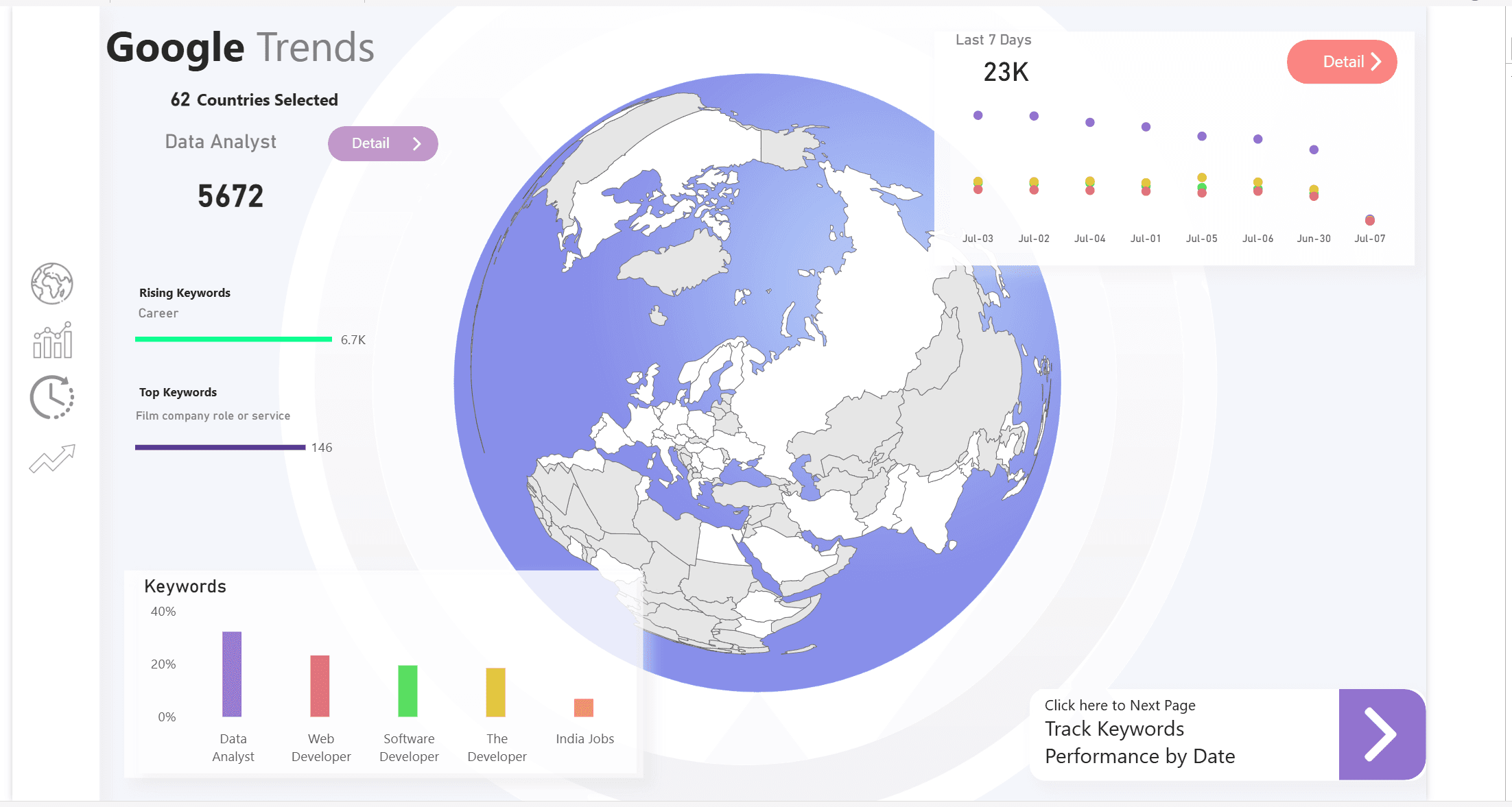
Market intelligence
Search trends, rankings, regional comparison, keyword movement, and navigation views.
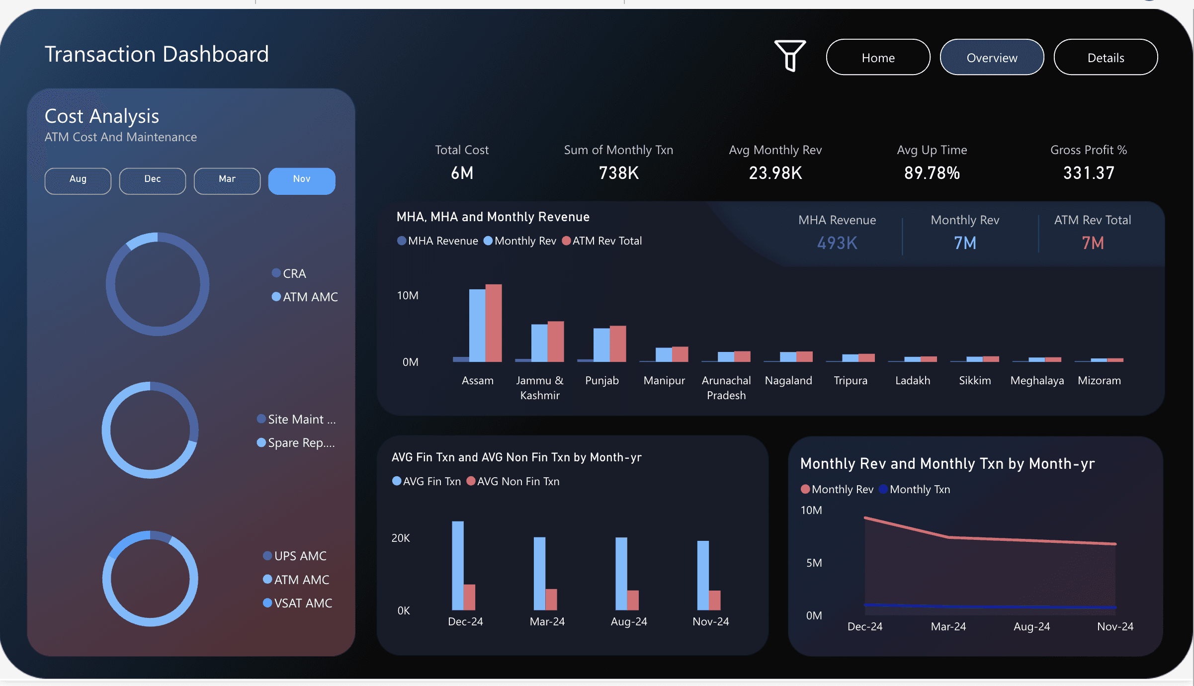
ATM transaction analysis
Transaction cost, maintenance, revenue, uptime, gross profit, and regional performance.
When a dashboard is enough
Sometimes the client really does only need a dashboard. If the source data is already clean, the KPI definitions are agreed, refresh is simple, and security is not complex, a focused Power BI build is the right move. There is no need to add Fabric just because it exists.
But if the report depends on multiple systems, manual cleaning, unclear formulas, sensitive data, or repeated reporting requests from different departments, it is time to design the stack. Otherwise, the first dashboard becomes the start of a reporting mess.
The practical way to start
Start with the business question, not the visual. What decision should the report improve? Who owns the data? Which source is authoritative? How often does the number need to refresh? Who is allowed to see it? What happens when a refresh fails?
Once those answers are clear, the architecture becomes easier to design. Power BI becomes the delivery layer for a data product, not a disconnected report file.
Useful Microsoft references
These are the official Microsoft Learn pages I would use when planning the stack and explaining why the dashboard needs a foundation: